From 'namaste' to 'wow, that’s me!
Using branding to define a yoga teacher’s identity
Lately, I’ve been reflecting on how branding helps create content that resonates with an audience. A strong brand isn’t just a nice-to-have; it’s essential for aligning communication and building trust. To explore this further, I’ve been revisiting some helpful resources like Trustworthy by Margot Bloomstein and Designing Brand Identity: A Complete Guide to Creating, Building, and Maintaining Strong Brands.
Applying branding lessons to a yoga teacher’s identity
During my first semester, I attended a course with Margot Bloomstein, where we worked on analyzing and creating brands for various organizations. Using BrandSort cards, we ran workshops to audit and develop brand identities. However, those experiences were all team-based, and I wanted to explore what this process would look like for an individual.
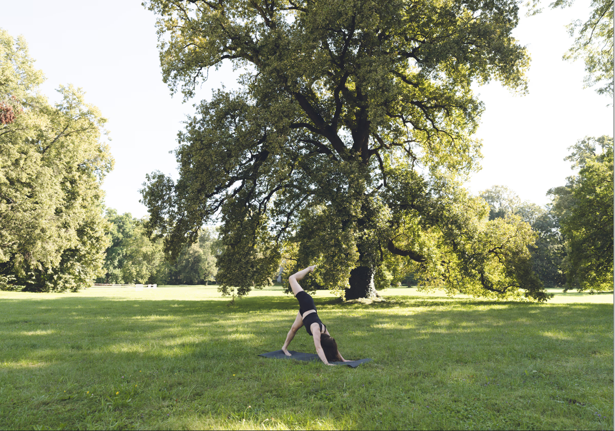
That’s when I thought of Mirjam, a friend who recently completed her yoga teacher training. Having already helped her with website photography, I realized this could be a great opportunity to further refine her online presence. She agreed to try out the branding process with me, so I set up a Miro board to guide us through the exercise.
Workshop overview: defining Mirjam’s brand attributes
To structure the session, we used the BrandSort methodology. Here’s how it worked:
- Sorting adjectives
I presented Mirjam with a set of adjectives and asked her to categorize them into three groups:- Who you aren’t
- Who you are
- Who you’d like to be
While she worked through this, I observed her thought process. Were there words she struggled with? Did she move words back and forth? Once she finalized her selections, we discussed the meaning of specific terms to better understand her vision.
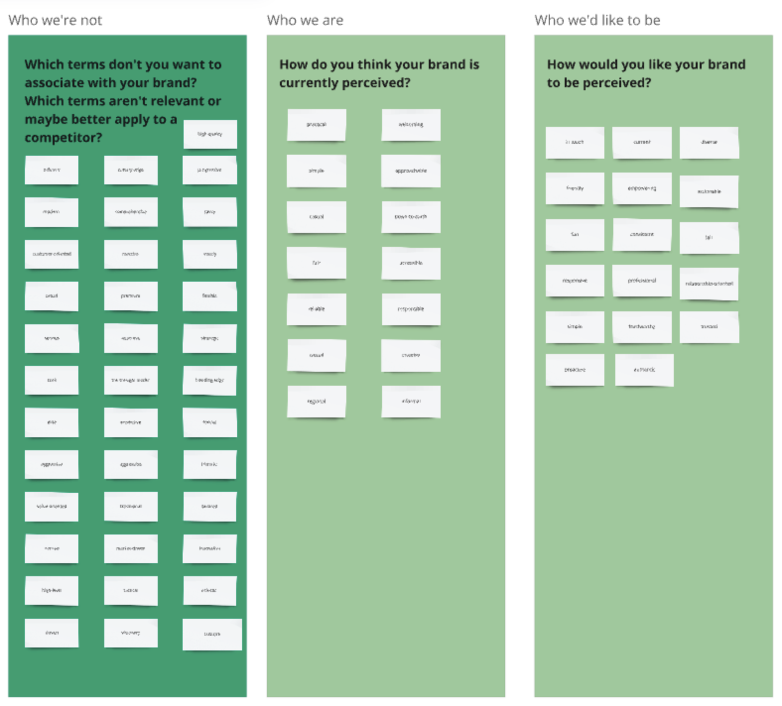
- Key insights
- Diverse: For Mirjam, this meant creating a welcoming space where people from all walks of life feel comfortable.
- Responsive: She wanted to show that she listens to feedback and adapts her teaching to meet her students’ needs.
- Not elite or premium: Her focus was on inclusivity and approachability, rather than exclusivity.
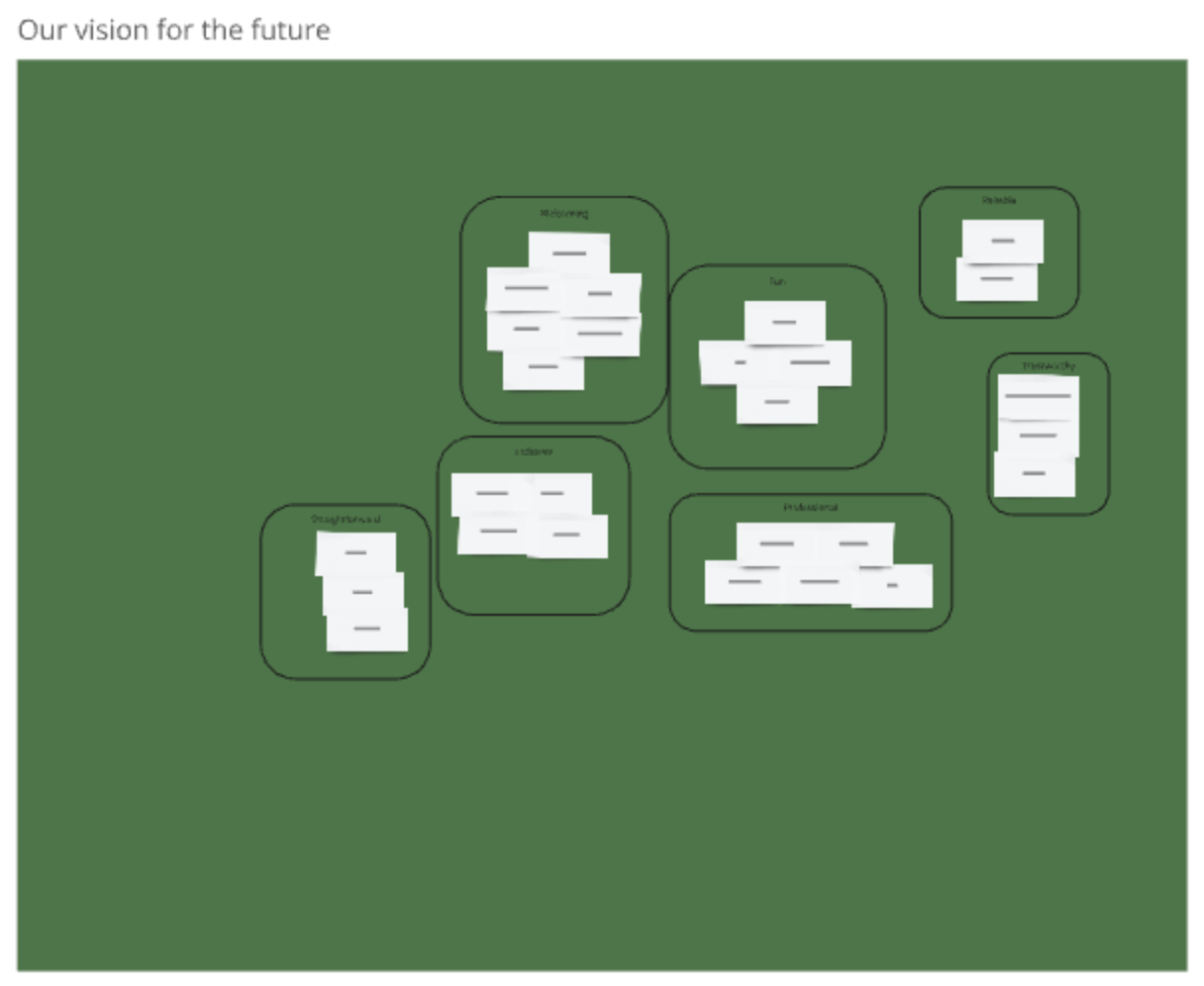
- Clustering and prioritizing
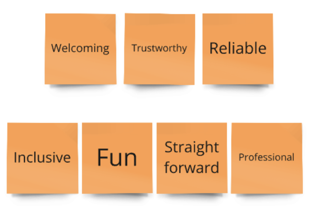
From the “Who you are” and “Who you’d like to be” columns, we grouped similar adjectives and prioritized them. This process resulted in the following key attributes:- Welcoming
- Trustworthy
- Reliable
- Inclusive
- Fun
- Straightforward
- Professional
Final message architecture
Movement with Mirjam: message architecture
Welcoming
Mirjam’s classes are open and inviting, ensuring everyone feels comfortable and valued.Trustworthy
She creates meaningful connections, prioritizing the well-being and growth of her participants.Reliable
Her classes are consistent and well-structured, offering participants a dependable experience.Inclusive
Mirjam’s teaching is accessible to all, regardless of ability, age, or background.Fun
Her classes blend yoga with moments of lightheartedness, making the experience enjoyable and uplifting.Straightforward
Mirjam communicates clearly and simply, making her classes easy to follow and understand.Professional
She combines warmth with expertise, ensuring her classes are safe, well-organized, and skillfully led.
Next steps and reflections
Mirjam was pleased with the workshop and found it helpful for clarifying her identity as a yoga teacher. She shared that this process would guide her Instagram content, class communication, and even her interactions on WhatsApp.
The next step is to audit her website and social media to assess how well her current branding aligns with this message architecture. For this blog post, I’ll focus only on her homepage.
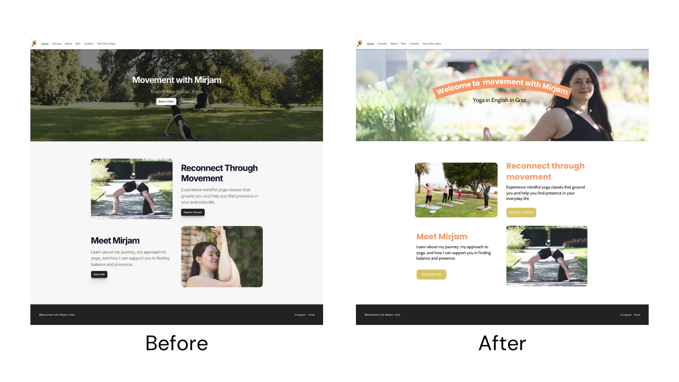
A quick audit of Mirjam’s website
Mirjam’s website, Movement with Mirjam, features strong visuals and clear calls to action. It conveys professionalism, trustworthiness, reliability, and straightforwardness. However, there’s potential to enhance its alignment with her other brand attributes:
Recommendations for improvement
Welcoming
Adding “Welcome” to the headline “Movement with Mirjam” could make the homepage more inviting.
Replacing the header image with one of Mirjam smiling could further enhance the friendly tone.Inclusive
Including photos of diverse class participants could better reflect her commitment to inclusivity.Fun
Brightening the color palette and using a more rounded font could highlight the lighthearted side of her brand.
I’m not a designer, but I thought a quick mockup would help us understand how just a few changes can influence the perception of a brand, even without diving into the wording of the text too much.
Conclusion
This exercise highlights the value of a message architecture in clarifying and enhancing an individual’s brand identity. For Mirjam, this process not only reinforced her goals as a yoga teacher but also laid the groundwork for improving her online presence and communication style. With these insights, she’s well-positioned to connect with her audience and grow her practice.